There is a small, constant tax in most expense apps, and you stop noticing you are paying it.
You are working down a list of forty expenses from a trip, checking each one against your bank statement. You click one. The app takes you to another screen. You check the number, hit Back, and land at the top of the list again — forty rows above where you were, with no idea which one you had just done. Multiply that by forty.
The fix is not a faster page. It is not going anywhere in the first place.
What a detail view actually has to do
Open a bill from a list and four things need to be true at once, and most implementations get two of them:
You keep your place. The list stays where it was, scrolled where it was, with the row you opened marked so you can see where you are.
Back does the obvious thing. It closes what you opened, rather than leaving the screen.
The thing you are looking at has an address. Refresh, and it is still there. Send the address to someone, and they see what you see.
You can follow a thread. A bill mentions a person, that person has other bills. Following that chain should not eject you from the list you were reading.
A modal dialog gets you the first two, badly, and never the third. A full page gets you the third and gives up the first. What you want is both, and the way to get both is to stop treating "which thing is open" as something the app remembers privately.
Put it in the address bar
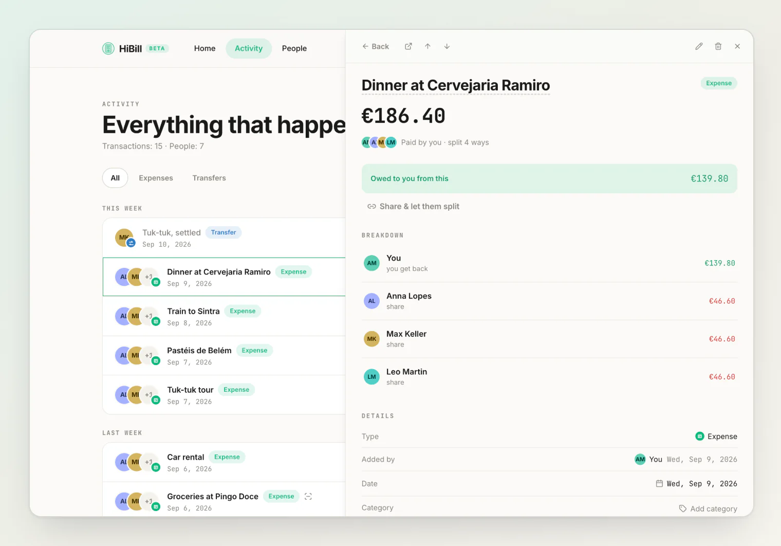
In HiBill, whatever is open in the side panel is written into the page URL — a transaction as ?peek=, a person as ?person=. Nothing about that is clever. It is just the observation that the open panel is part of where you are, and where you are belongs in the address bar.
Everything nice follows from that one decision, for free:
A refresh keeps it. Not a reconstruction, not a best guess. The same bill, on the same list, at the same scroll position.
The link is a link. Copy the address, send it to the person you split the flight with, and they open exactly the bill you were looking at. Access rules do not change — someone who is not on the transaction still sees nothing — so for sending a bill to someone without an account, there is still public sharing.
Back means back. Not "leave the page". The browser already keeps a stack of everything you had open, so the Back button steps down through it, one bill at a time, and leaves the page only when the stack runs out.
That last one is why the panel also has its own Back button, sitting at the head of the panel header. It does nothing more than the browser's Back button does. It is there because on a laptop your hand is on the trackpad and the panel is on the right, and asking people to travel to the browser chrome to undo something they did in the app is a small rudeness.
Following a chain without leaving the list
The fourth requirement is the interesting one.
Open a dinner from the activity feed. The split shows four names. Click one, and rather than closing and navigating you somewhere else, the panel becomes that person: their balance, their shared transactions. Click one of those, and the panel becomes that bill.
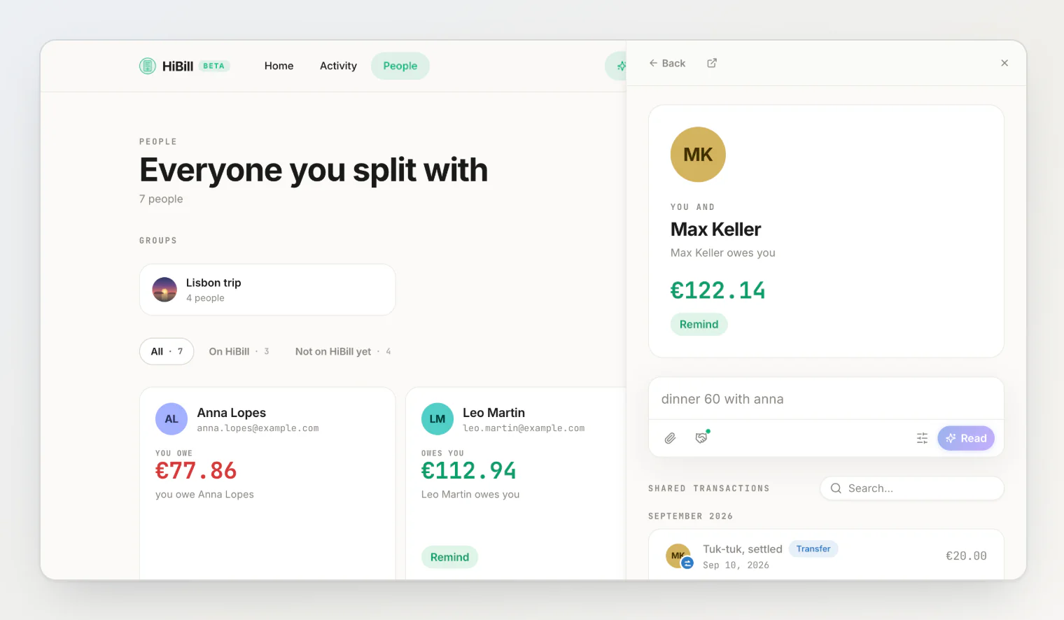
You can go three or four steps down that chain — a bill, someone on it, another of their bills — and the list you started from has never moved. Then Back, Back, Back, and you are exactly where you were, having answered the question you went looking for. That is the whole feature. Everything else is trim.
The trim is worth having, though. When a transaction is open, the panel header carries previous and next arrows that walk the list you opened from, in the order it is displayed. The ↑ and ↓ keys do the same. Reviewing a month of expenses turns into holding a key and reading, which is what reviewing should be. And on desktop the panel's left edge is a drag handle, because 520 pixels is right for a two-line dinner and wrong for a receipt with thirty items — your width is remembered for next time.
Why it isn't a modal
A modal would have been less work. We did not use one, for two reasons.
A modal makes the list dead. Dimmed, unscrollable, unclickable. But the list is the context — often what you want is to compare the open bill against the three around it, or to scroll on and open something else. There is no dimming layer here. The list underneath stays live, and clicking it does not slam the panel shut.
A modal traps the keyboard. Escape has to mean one thing in a modal, and it usually means "throw away everything". In the panel, Escape while you are typing a comment gets you out of the field, and only closes the panel on the second press. Escape in a filter box on the page behind it does nothing to the panel at all. Small rules, but they are the difference between a keyboard being useful and a keyboard being a hazard.
The one place a modal is right is a phone, where there is no room for two things side by side. So on a phone the panel takes the screen — and the address still carries what is open, which means a link you send from your phone opens the same thing on someone's laptop.
See it
It is live now for everyone, on the dashboard, in the activity feed, on People, and inside a person's ledger. Click anything.
The mechanics are written up in opening transactions and people in the side panel, and if you are new here, how HiBill works is the wider tour.
Continue reading
How HiBill Works: A Quiet Ledger for the Money Between Friends — the whole model in one read: people, balances and the two kinds of transaction.
How to Find a Shared Expense Fast: Search a Group or a Person — narrowing a long list down to the one bill you want to open.
How to Fix a Shared Expense After You've Already Saved It — what you can change from the panel, and what everyone else sees when you do.